Syntactx
branding
Syntactx delivers the highest quality clinical research services based on a well-defined strategy, collaboration, and transparency, thereby reducing time to execution and minimizing the overall risk of a project. Clients benefit from their agility, decades of experience, on-staff physicians, and excellent relationships.

Syntactx targets top-level executives and medical professionals who are decision makers looking for highest quality clinical research services.
The creative process for re-branding Syntactx included producing a new logo. The early logo comps played with the ’S’ in Syntactx, with shapes reflecting their extensive experience and commitment to excellence. We experimented with hexagonal symbols representing teamwork and efficiency. That hexagonal symbol morphed into a network of lines that symbolize the neurons within the brain, as well as branches of a tree.
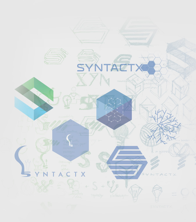
The neurons represented innovation and the tree branches represented knowledge and experience, all tremendous qualities strengths of Syntactx. That symbol was then converted to three different versions; Organic, Geometric, Dimensional. The dimensional logo treatment emerged as the clear winner because of its clean lines and modern aesthetic. When combined with the custom font, the logo symbolizes innovation, experience, network, and growth.

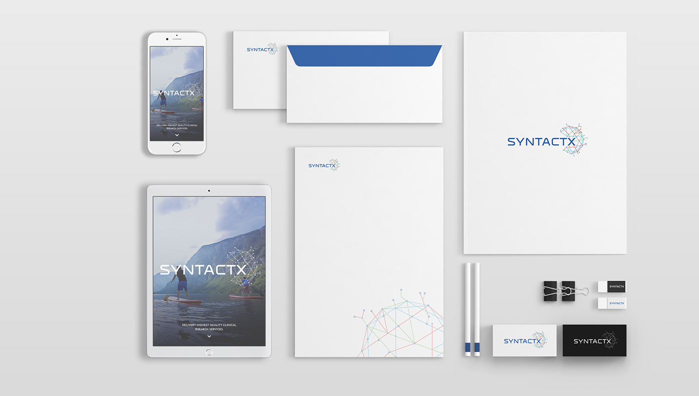
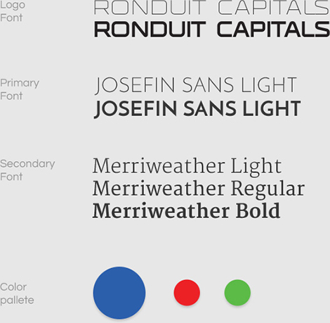
The cerulean blue was enhanced by bright green and red, contributing to the trustworthy quality of the brand and separating it from otherwise mundane medical logos and websites.
Complementary fonts were chosen to maintain a consistent look and feel across all brand verticals and deliverables.
Wireframes for the Site

Rotoscoping was used in After Effects to create a 3D video experience for the splash image of the site