overview
We were given half a semester to explore and design a product on the topic of personal safety. Since I also major in psychology, I thought it would be interesting to examine how people interact with their friends on various social media platforms, and how users decided what to share with different groups of friends. I was interested in the area of online privacy and how it relates to users' feelings of personal safety. Users sometimes feel wary of oversharing because they do not want certain information shown to certain groups of people, and sometimes feel unsafe when strangers can see their private data.
Users also are confused about what is visible to whom. Although Facebook offers customisations in their settings, it is hard for users to find them and understand the effects of changing certain settings. Some users will hide certain posts from their parents or from co-workers.
goal
The goal of Lucid is to provide clarity to users about who can see their posts on various social media platforms. Lucid makes users feel safe by allowing them to see through the lens of their various social groups (family, work, and friends) and know what is visible to each group.
research
Social identity theory states that social role is a critical component to understanding human relationships. It provides a structure, guiding people in their choice of actions (what to share on social media). Social tie strength is defined by time, intimacy, intensity and reciprocality. This is important because privacy on the internet is dependent on peoples' social ties.
Jones & O'Neill found 6 criteria of grouping that people consider for categorising their social groups:
- social circles and cliques
- tie strength
- temporal episodes
- geographical locations
- functions of roles
- organizational boundaries
This is a lot for people to consciously register and think about for every single person in their life. Not only is the cognitive load incredibly high, it would also be very time consuming for users to do this.
In the paper "Mining Smartphone Data to Classify Life-Facets of Social Relationships," researchers show that they can classify the category of relationship at 90.5% accuracy based on call duration, method of communication (text, phone calls, email) and time of daily communication using machine learning techniques. This means they can accurately classify whether the person in your social group belongs in the friend, family or work category.
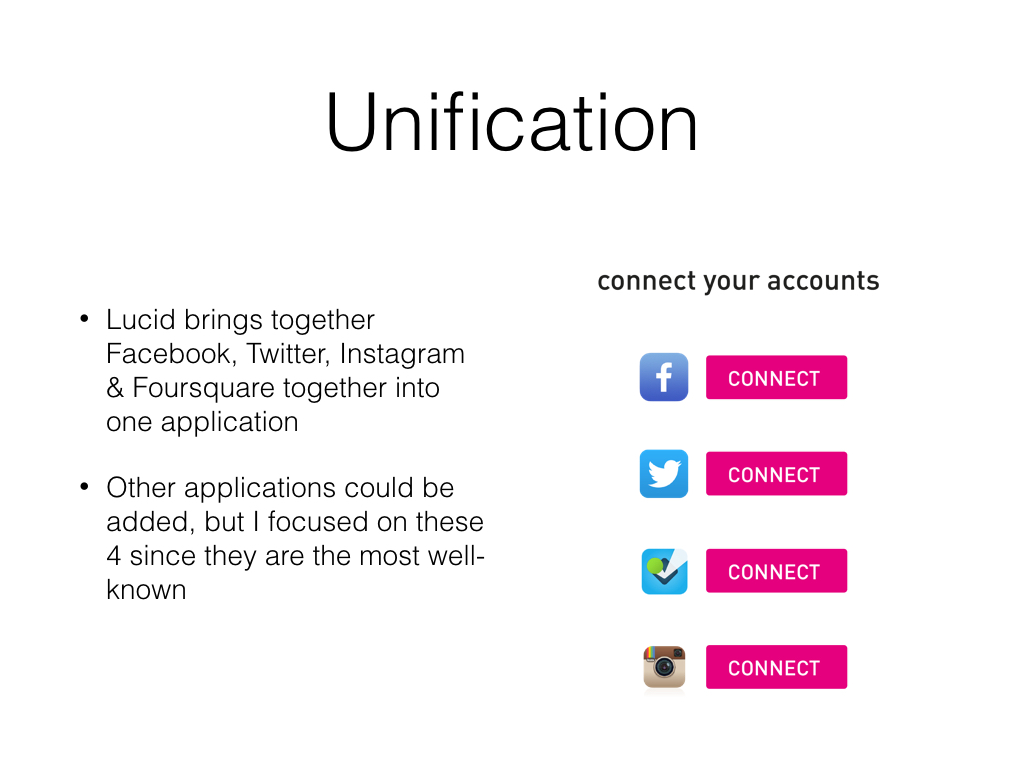
This was really interesting to me since social services operate on overly-simplified notions of social role. For example, Facebook automatically classifies everyone as a "friend." Users have to manually change the classification to "close friend" or "acquaintance." But no one wants to spend a lot of time categorising people and making lists of their Facebook friends. Since machine learning can classify your contacts for you, there is no need to expect the user to do it manually. I decided a mobile app was the best way to help clarify for users what their contacts can see since mobile phones have access to phone call, email and text data.


user interface
The types of data I considered showing to the user were
- latitude/longitude coordinates or location of the check-in or post
- timestamp
- duration of stay at location
- other people around the user's current location
- trends - how often the user goes to certain locations, which days they tend to check-in to that location
I decided to omit the last two pieces of information since I wanted the focus of the app to be about user privacy and empowering the user to know what information is visible to others.
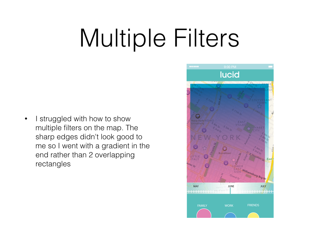
I was inspired by the primary colours - red, yellow and blue as well as CMYK since they are the basis for all other colours. And friends, family and co-workers are the core basis of users' social circles, and define users' identity. I decided against red though because red is usually used for warnings and error states. I used pink for family because pink/red is associated with love and closeness to the heart. I chose yellow for friends because it's warm and happy, and blue for work because it's associated with professionalism.
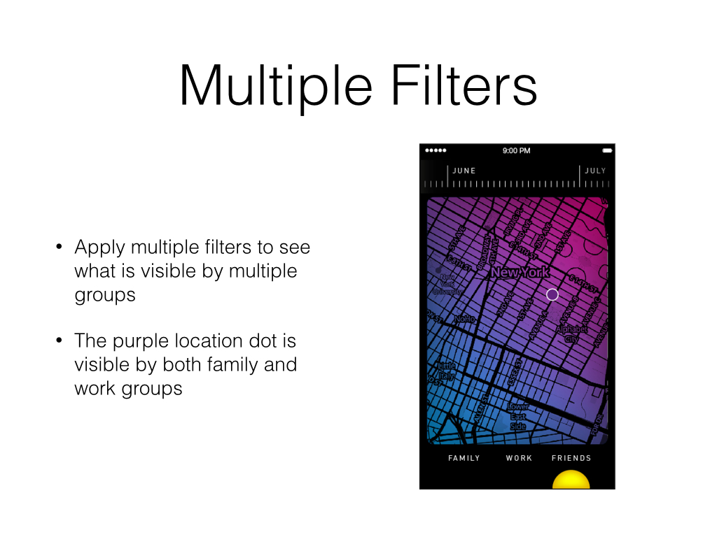
metaphor of filters - allows the user to see through the lens of different social groups
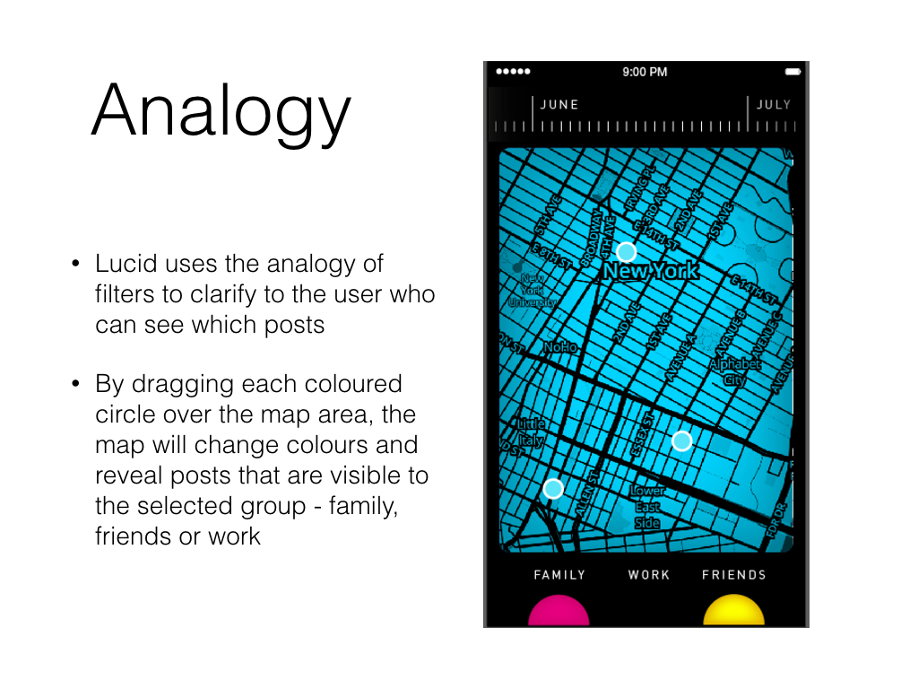

I chose these colours because they were similar to primary colours, which are the basis for all other colours, and family, work and friends are the basis of our social groups, and therefore very defining of identity as an individual. Family is pink because it is close to the heart. I also wanted to avoid red, which is usually used for warnings, error states or danger.
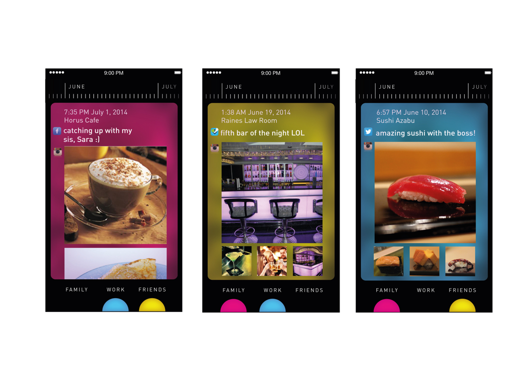
Users can see the platforms used for each check-in, the caption, and any photos uploaded. Since transparent overlays were popular at the time, I kept the background of the post the same color as the filter, with subtle parts of the map visible underneath.
Process

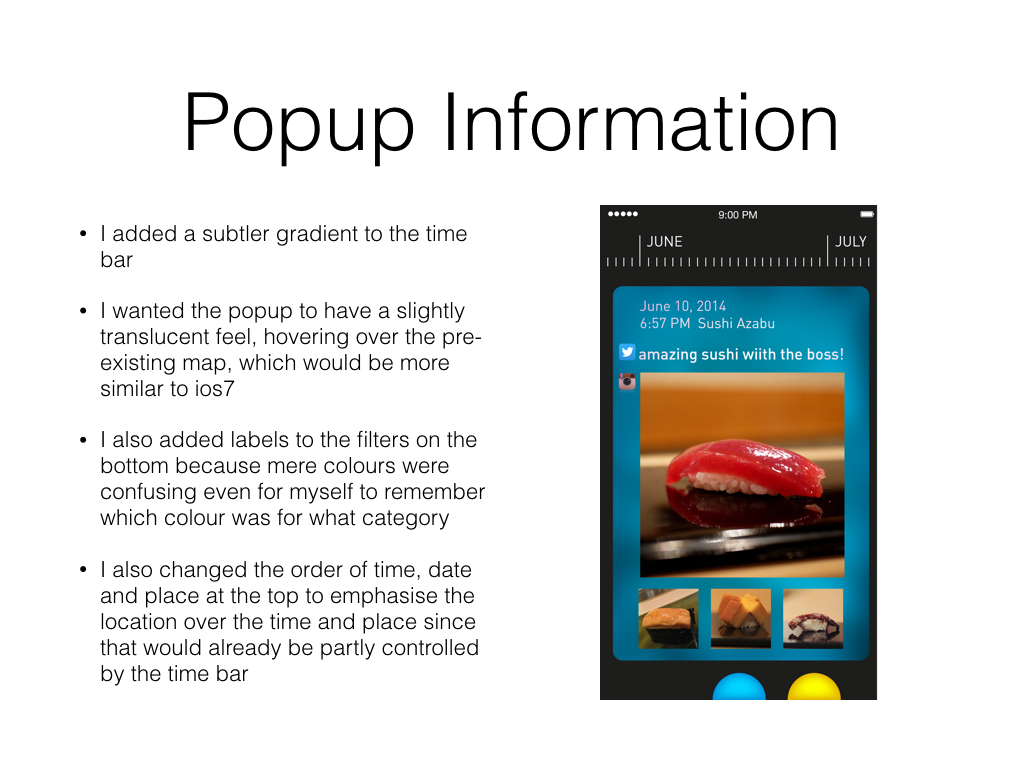
I felt that my original pastel colour palette was not suited for a serious application. Pastels suggest a younger or female only audience. In keeping with the analogy of filters, I wanted a more stylised look, where the filters should at least look more like a filter rather than just a circle. The gradient for the time bar was also too extreme compared to the rest of the flat interface. The battery bar at the top and the name of the application in the top middle was also taking up unnecessary space, especially for a whole screen application such as a map. The information that popped up after tapping a location star was also extremely small and hard to read - there was no reason why it could not take up the whole screen. Cutting the circle filters in half also allowed the filters to feel grounded at the bottom of the app, rather than floating around.